
Not sure which colors to choose for your next gothic coloring page? Start with the mood you want to create: soft and dreamy, romantic, antique, or rich with jewel tones.
These seven gothic color palettes from Shima Artworks each include four colors, HEX codes, and simple ideas for using them. Try them with colored pencils, markers, or digital coloring tools. You can also use them with our free gothic coloring pages inspired by Cute Gothic Oddities.
You do not need a large collection of supplies or an exact color match. A few similar shades are enough to get started.
Choose Your Gothic Color Palette
Use this quick guide to find a palette that suits your page. These are starting points—you can use any palette with any design you enjoy.
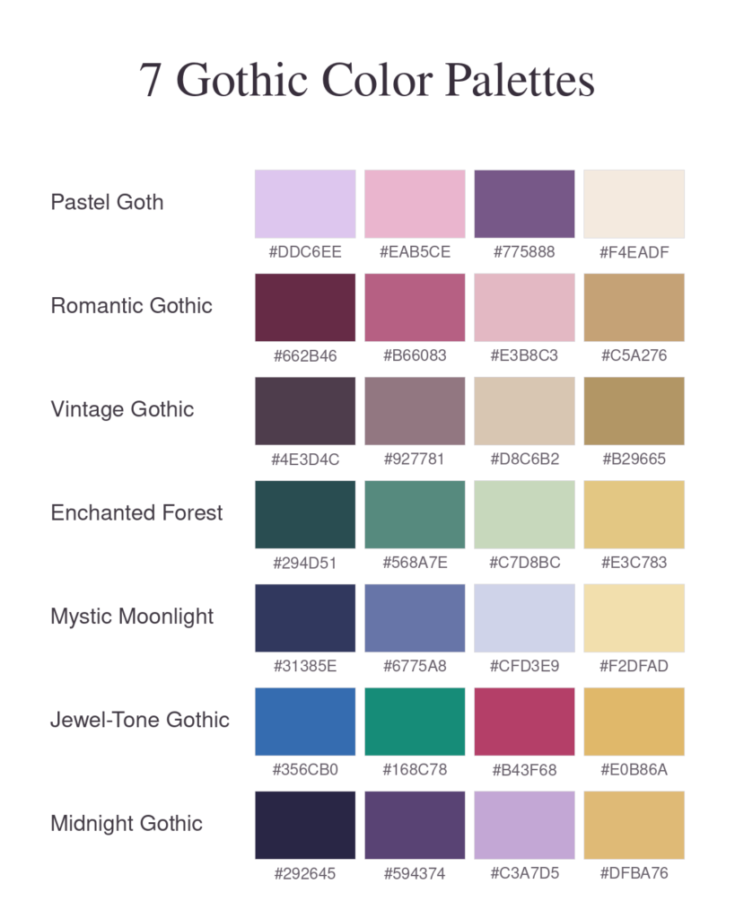
How to Use These Gothic Color Palettes
Choose one palette, then decide which color you would like to use most. Pick a second color for supporting details and save another for small accents. You can leave parts of the paper white to keep the design light and give your eyes a place to rest.
The four swatches are your starting colors. The decorative illustrations beside them show a possible mood, with additional shading and highlights. You do not need to reproduce every shade or detail.
With Colored Pencils
Choose the closest colors from your pencil collection and make a small swatch of each on spare paper. Whenever possible, use the same paper as your coloring page.
Start with light pressure. Build up the color gradually where you want more depth, leaving other areas lighter. A lavender pencil used lightly and then more firmly can give you variation without adding another color.
With Markers
Test your markers before coloring, especially when choosing pale shades. Keep your lightest colors for areas you want to stand out, since it is difficult to make a dark marker area lighter afterward.
Use paper suited to your markers and place a protective sheet underneath. A single-sided coloring page still needs protection if your ink bleeds through.
With Digital Coloring Tools
Enter the HEX codes into your app’s color picker to build a four-color palette. Use the colors as flat fills, then add shading if you like.
Screens, printers, paper, and art supplies can all change how a color looks. Treat the codes as digital references and the physical color matches as flexible choices.
Make These Palettes Your Own
Each four-color palette is a starting point, not a limit. Use the suggested shades for the main elements, then add colors that suit your page. Cream, beige, warm gray, and soft brown can be useful for details such as mushroom stems, stone floors, and baked treats.
You can also combine palettes. In the Moonlit Greenhouse example below, Enchanted Forest inspires the plants and golden flower, while Mystic Moonlight brings soft blues and lavender to the night sky. A few supporting neutral colors help finish the scene. Choose the closest pencils or markers you have, and adjust the colors to make the page your own.
7 Gothic Color Palettes with HEX Codes
1. Pastel Goth – Soft & Spooky
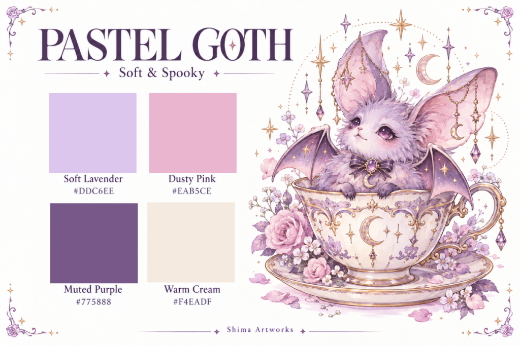
The Pastel Goth color palette pairs lavender and pink with a deeper purple and warm cream. It is a gentle starting point for cute creatures and cozy scenes when you want a gothic touch without a very dark page.
| Color | HEX Code | Suggested Use |
|---|---|---|
| Soft Lavender | #DDC6EE | A character’s body or larger decorative areas |
| Dusty Pink | #EAB5CE | Flowers, inner ears, and small accents |
| Muted Purple | #775888 | Bat wings or details that need definition |
| Warm Cream | #F4EADF | Teacups, saucers, and pale background details |
Coloring idea: Give a little bat a Soft Lavender body and Muted Purple wings. Use Warm Cream for its teacup, then add Dusty Pink to a few small details.
Keep it balanced: Let the lighter colors cover most of the page. Use Muted Purple in selected areas so the result stays soft.
Try it on: A bat in a teacup or a whimsical cat design.
2. Romantic Gothic – Roses & Velvet
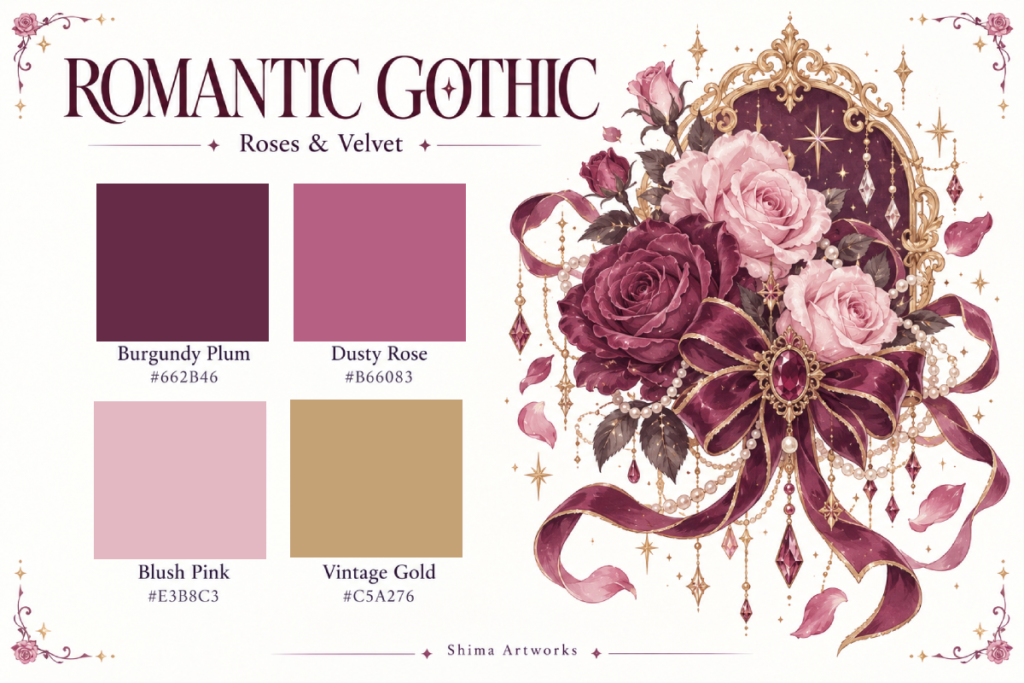
Burgundy Plum gives this palette depth, while Dusty Rose and Blush Pink soften the overall effect. Vintage Gold adds a warm finishing touch to frames and ornaments.
| Color | HEX Code | Suggested Use |
|---|---|---|
| Burgundy Plum | #662B46 | Ribbons, deep rose petals, and fabric |
| Dusty Rose | #B66083 | Main flower petals and decorative patterns |
| Blush Pink | #E3B8C3 | Lighter petals, cushions, and delicate details |
| Vintage Gold | #C5A276 | Frames, jewelry settings, and small trim |
Coloring idea: Color a large rose in Dusty Rose with Blush Pink on the lighter petals. Choose Burgundy Plum for a nearby ribbon, then repeat Vintage Gold on a few decorative edges.
Keep it balanced: Place a light pink beside the deepest plum so neighboring shapes remain easy to see. You can use these pinks and purples for leaves, too, if you prefer a fantasy look.
Try it on: Roses, ornate accessories, or a decorated jewelry box.
3. Vintage Gothic – Antique & Whimsical
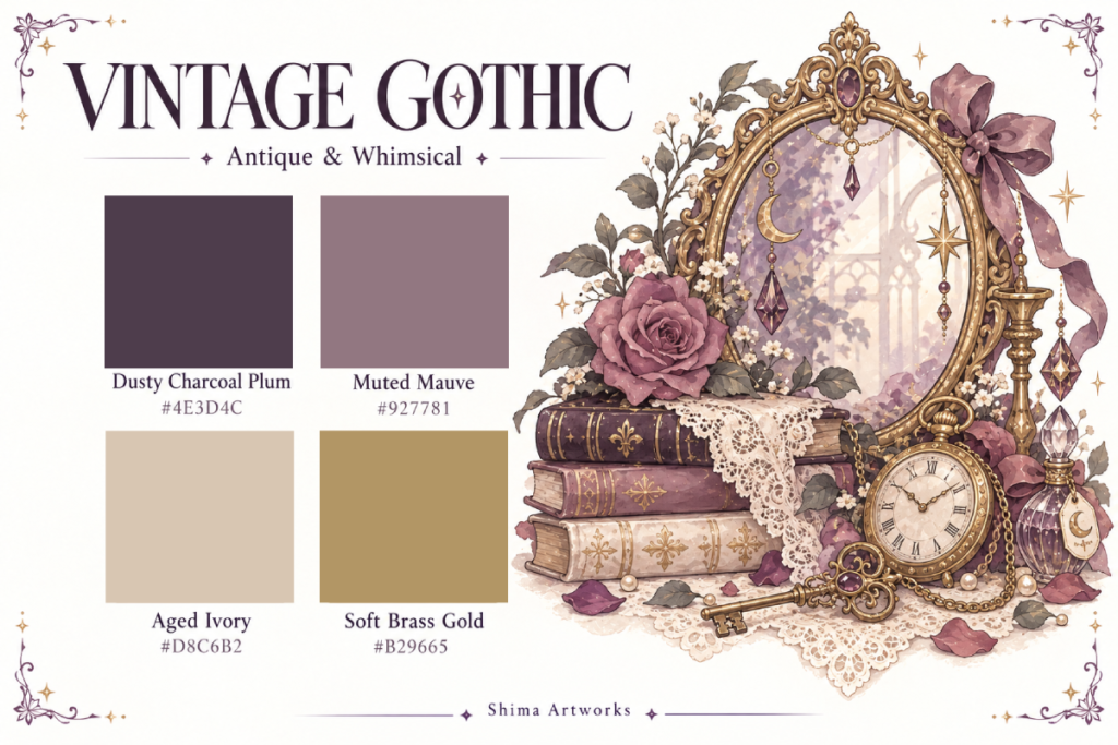
This muted palette brings together charcoal plum, mauve, aged ivory, and brass gold. Use it to suggest old books, worn furnishings, and treasured objects in a quiet gothic room.
| Color | HEX Code | Suggested Use |
|---|---|---|
| Dusty Charcoal Plum | #4E3D4C | Book covers, furniture edges, and dark fabric |
| Muted Mauve | #927781 | Flowers, upholstery, and supporting details |
| Aged Ivory | #D8C6B2 | Book pages, clock faces, and pale surfaces |
| Soft Brass Gold | #B29665 | Keys, handles, and decorative metalwork |
Coloring idea: Alternate Dusty Charcoal Plum and Muted Mauve across a stack of book covers. Color the page edges in Aged Ivory and use Soft Brass Gold for a nearby key or book ornament.
Keep it balanced: Repeat Aged Ivory in several places to separate the darker objects. Leave tiny highlights white if you want a little extra contrast.
Try it on: Library scenes, antique furniture, or a cozy ghost bakery.
4. Enchanted Forest – Magical Greens & Gold
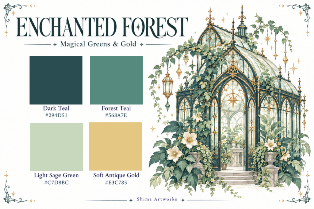
Two teal shades and a light sage green create a leafy palette, while Soft Antique Gold adds warmth. This combination suits plants, glasshouses, and garden scenes with a touch of magic.
| Color | HEX Code | Suggested Use |
|---|---|---|
| Dark Teal | #294D51 | Greenhouse frames and selected dark leaves |
| Forest Teal | #568A7E | Main foliage and climbing vines |
| Light Sage Green | #C7D8BC | Pale leaves, pots, and soft background details |
| Soft Antique Gold | #E3C783 | Decorative trim, lanterns, and flower centers |
Coloring idea: Use Dark Teal for a greenhouse frame, Forest Teal for most of the vines, and Light Sage Green for a few clusters of leaves. Add Soft Antique Gold to small architectural details.
Keep it balanced: Alternate light and dark leaves where plants overlap. Leave some glass panes white or lightly colored so the greenhouse feels open.
Try it on: The Moonlit Greenhouse or another plant-filled coloring page.
5. Mystic Moonlight – Dreamy Blues & Moonlight
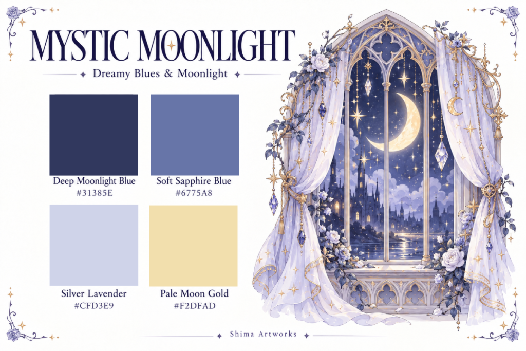
This palette uses blue and silver-lavender shades with a pale golden accent. It is a lovely option when you want a moon or star to look bright against a cool nighttime setting.
| Color | HEX Code | Suggested Use |
|---|---|---|
| Deep Moonlight Blue | #31385E | Night skies and darker surrounding areas |
| Soft Sapphire Blue | #6775A8 | Clouds, curtains, and supporting shapes |
| Silver Lavender | #CFD3E9 | Pale fabric, light details, and soft highlights |
| Pale Moon Gold | #F2DFAD | Moons, stars, and small points of light |
Coloring idea: Color a crescent moon in Pale Moon Gold and use Deep Moonlight Blue in the space around it. Add Soft Sapphire Blue to nearby shapes and Silver Lavender to lighter details.
Keep it balanced: If coloring a large dark background feels overwhelming, use the deepest blue in a smaller area near the moon. You can leave the rest of the background white.
Try it on: A crescent moon design or a magical nighttime scene.
6. Jewel-Tone Gothic – Rich & Enchanting
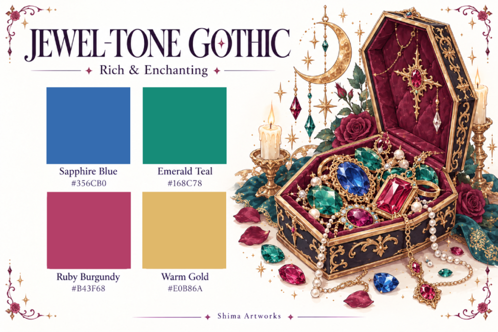
Sapphire Blue, Emerald Teal, and Ruby Burgundy bring color to gemstones and decorative objects. Warm Gold ties them together with the feeling of ornate jewelry.
| Color | HEX Code | Suggested Use |
|---|---|---|
| Sapphire Blue | #356CB0 | Blue gemstones or one main decorative object |
| Emerald Teal | #168C78 | Green gemstones, leaves, and supporting details |
| Ruby Burgundy | #B43F68 | Roses, cushions, and ruby-colored jewels |
| Warm Gold | #E0B86A | Jewelry settings, chains, and box trim |
Coloring idea: Choose Sapphire Blue for the largest gemstone, Emerald Teal for smaller stones, and Ruby Burgundy for the surrounding fabric or flowers. Repeat Warm Gold around their settings.
Keep it balanced: Let one jewel color lead instead of giving all three equally large areas. Leave small sections of each gem white to suggest reflected light.
Try it on: A coffin jewelry box, decorative bottles, or magical accessories.
7. Midnight Gothic – Magical & Elegant
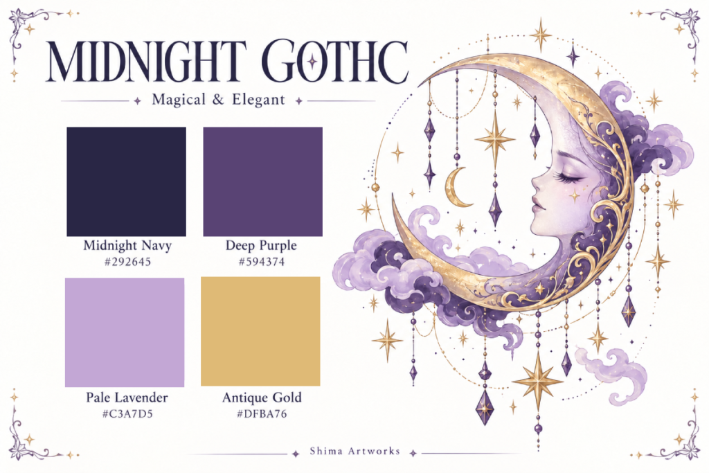
Midnight Navy and Deep Purple create a darker foundation, while Pale Lavender and Antique Gold help individual details stand out. Choose this palette for a more dramatic celestial page.
| Color | HEX Code | Suggested Use |
|---|---|---|
| Midnight Navy | #292645 | Night skies and selected dark background areas |
| Deep Purple | #594374 | Moth wings, fabric, and larger decorative shapes |
| Pale Lavender | #C3A7D5 | Clouds, light patterns, and contrasting details |
| Antique Gold | #DFBA76 | Moons, stars, and small ornaments |
Coloring idea: For a moth design, use Deep Purple on the wings and Pale Lavender within the wing patterns. Add Antique Gold to a few details, then use Midnight Navy sparingly around the main subject.
Keep it balanced: Avoid placing the two darkest colors across every neighboring shape. A strip of lavender or a little uncolored space can help the design remain clear.
Try it on: A gothic moth, crescent moon, or star-filled design.
Try Midnight Gothic on a Crescent Moon Coloring Page
This coloring example shows how the Midnight Gothic palette can bring warmth and contrast to a crescent moon design. Antique Gold makes the moon stand out against the Midnight Navy background, while purple and lavender soften the roses, leaves, and sleeping star.
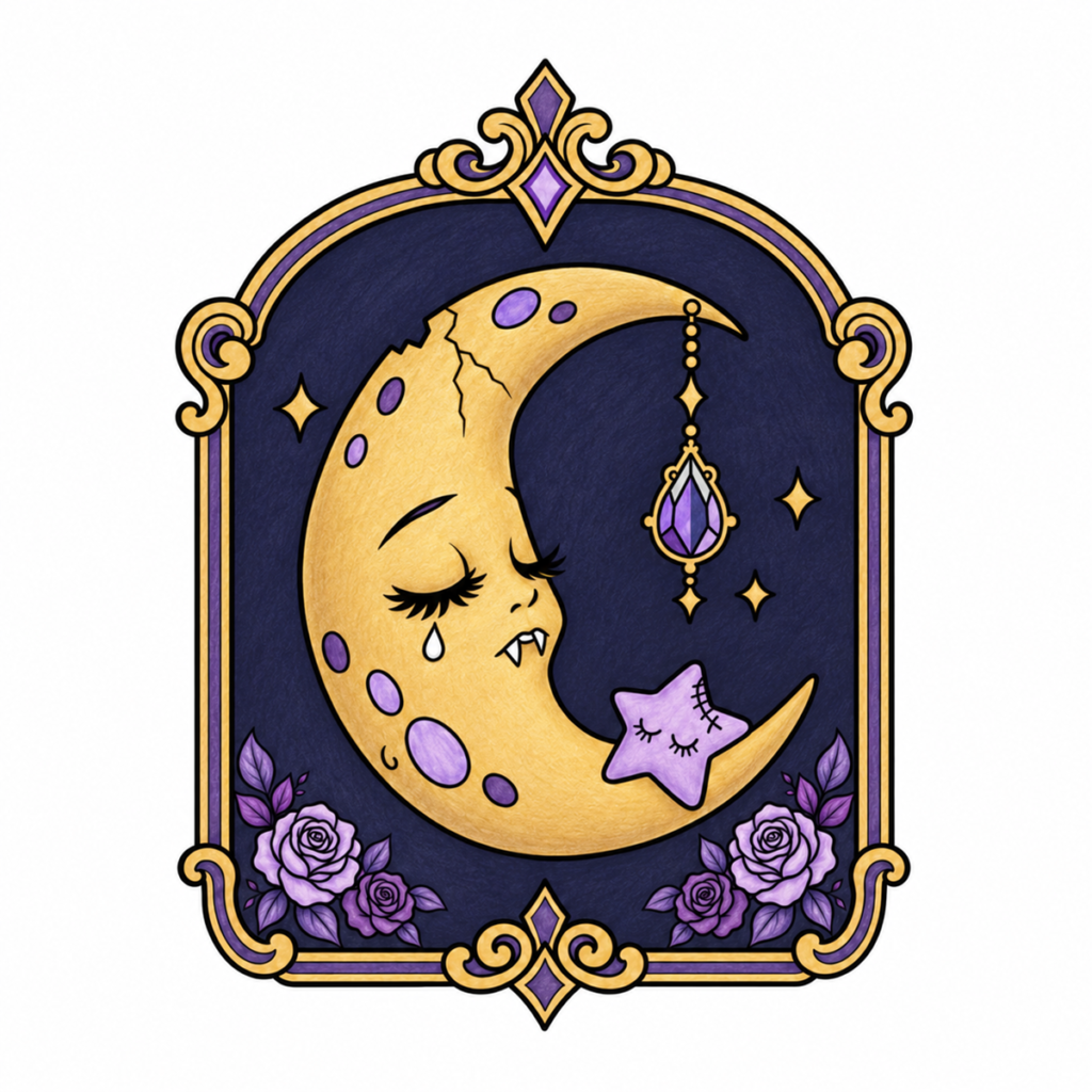
AI-generated color inspiration using the Midnight Gothic palette, with a colored-pencil-style finish.
Use the steps below as a guide for your own coloring. Choose similar shades from your supplies—you do not need an exact match.
1. Test your four colors first.
Make small swatches of Midnight Navy, Deep Purple, Pale Lavender, and Antique Gold on spare paper. Try layering Deep Purple and Pale Lavender together to see how they blend.
2. Color the moon, frame, and small stars in Antique Gold.
Use light pressure for the first layer, then gradually deepen the color near the moon’s curved edges and the frame’s ornamental curves. Leave lighter areas to suggest soft highlights. A golden-yellow or ochre pencil works well; metallic supplies are optional.
3. Add purple and lavender to the smaller details.
Alternate Deep Purple and Pale Lavender in the moon’s oval markings. Use Pale Lavender for the sleeping star, with a little Deep Purple near its edges. Repeat these shades in the hanging gemstone’s existing facets and the frame’s decorative sections.
4. Give the roses gentle depth.
Use Pale Lavender on the larger roses and Deep Purple on the smaller blooms. Deepen the areas between overlapping petals, keeping the petal edges lighter. Short, curved pencil strokes can help follow each petal’s shape.
5. Keep the leaves lighter than the background.
Start with Deep Purple, then layer Pale Lavender through the centers or toward the tips of the leaves. Keep these lighter areas visible so the leaves stand out against the navy. Reserve Midnight Navy for only the smallest leaf shadows.
6. Build up the navy background inside the frame.
Carefully color the spaces around the moon, hanging jewel, stars, and flowers with Midnight Navy. Include the open curve of the crescent and the small gaps between the leaves. Work in light, overlapping layers to build even coverage, keeping the black outlines clear.
7. Preserve the white details and check the balance.
Leave the background outside the decorative frame white, along with the moon’s tear and fangs. Check that the golden moon remains the focal point and that the purple leaves are easy to distinguish from the background.
Prefer a lighter version? Leave the background inside the frame white, or color only a few selected areas in navy. You can enjoy the same palette without filling a large dark background.
Your finished page does not need to match the example exactly. Flat colors, lighter shading, or different placements of the same four colors can all create your own version of Midnight Gothic.
Combine Enchanted Forest and Mystic Moonlight on a Greenhouse Coloring Page
You don’t have to stick to a single palette—or limit yourself to four colors. This Moonlit Greenhouse example combines the botanical greens of Enchanted Forest with the dreamy blues of Mystic Moonlight, then adds a few natural browns and soft neutrals.
The greens bring the plants to life, while the blue-and-lavender sky creates a gentle nighttime setting. A creamy golden flower becomes the focal point, balanced by pale stonework and a warm brown mushroom.
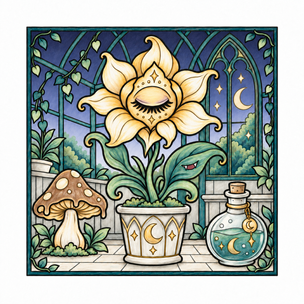
AI-generated color inspiration combining Enchanted Forest and Mystic Moonlight, with additional supporting colors and a colored-pencil-style finish.
1. Give the Greenhouse a Dark Teal Framework
Use Dark Teal (#294D51) as a guide for the outer frame and greenhouse supports. Repeating this deep teal throughout the structure helps connect the different parts of the scene.
With colored pencils, build the color gradually and leave a few lighter areas along the edges for subtle highlights.
2. Mix Teal and Sage for the Greenery
Use Dark Teal (#294D51), Forest Teal (#568A7E), and Light Sage Green (#C7D8BC) as starting points for the outdoor trees, climbing ivy, and larger leaves.
Vary the balance from one area to another. Try more sage on some ivy leaves, richer teal on others, and layered greens in the distant trees. On the large foreground leaves, place darker colors near folds and lighter sage along curved surfaces.
You don’t need a separate pencil for every shade: changing your pressure and layering two colors can create useful variations.
3. Build a Soft Moonlit Sky
Use the three cool shades from Mystic Moonlight to move from a darker upper sky to a lighter area near the trees:
- Deep Moonlight Blue (#31385E): the upper sky.
- Soft Sapphire Blue (#6775A8): the middle section.
- Silver Lavender (#CFD3E9): the lower sky.
Apply light layers and overlap the colors gently where they meet. Carry the same transition across neighboring windowpanes so the sky feels continuous behind the greenhouse supports.
For the crescent moon and stars, take inspiration from Pale Moon Gold (#F2DFAD). Their soft warmth stands out against the cool sky.
4. Make the Flower the Warm Focal Point
Combine cream with Soft Antique Gold (#E3C783) for the central flower. Keep selected areas of the petals light, then layer richer gold near their bases and overlapping edges.
Use slightly deeper gold around the closed eye to connect the flower’s center with its petals. A small amount of lavender shading on the eyelid echoes the sky without overpowering the golden flower.
Follow the curves of the petals with your pencil strokes to suggest gentle dimension.
5. Add Neutral Colors Where They Help
Supporting colors give the smaller objects their own character:
- Mushroom: natural brown on the cap, cream on the spots and stem, and warm beige or ochre beneath the cap.
- Pot, walls, and floor: ivory and light warm gray, with slightly deeper shadows along edges and beneath objects.
- Potion bottle: pale gray around the glass edges, lighter highlights, and teal for the liquid.
- Leaf’s mouth: a small muted red accent, keeping the fangs white.
These colors do not need to match either palette exactly. Choose shades that work with the pencils or markers you already own.
6. Check the Overall Balance
Pause occasionally and look at the page from a little farther away. The golden flower should remain easy to notice, the green leaves should stand apart from the sky, and the pale walls and floor should give the eye somewhere to rest.
If an area looks unfinished, add a light layer of color or a little shading. If the background feels too strong, keep your remaining layers softer rather than making every object darker.
Treat each palette as a starting point. Borrow colors from another palette, add useful neutrals, and adjust the balance to suit your page.
Try your own combination on the free Moonlit Greenhouse coloring page, available in our collection of free cute gothic coloring pages.
Try Jewel-Tone Gothic on a Coffin Jewelry Box Coloring Page
The Jewel-Tone Gothic palette brings rich blue, teal, and burgundy accents to this ornate coffin jewelry box. Warm gold connects the decorative details, while charcoal plum and dusty rose give the colorful jewels a balanced setting.
This example uses the four palette colors as a starting point, with supporting shades for the box, fabric, pearls, and mirror. You can choose similar colors from your own pencils or markers—an exact match isn’t necessary.
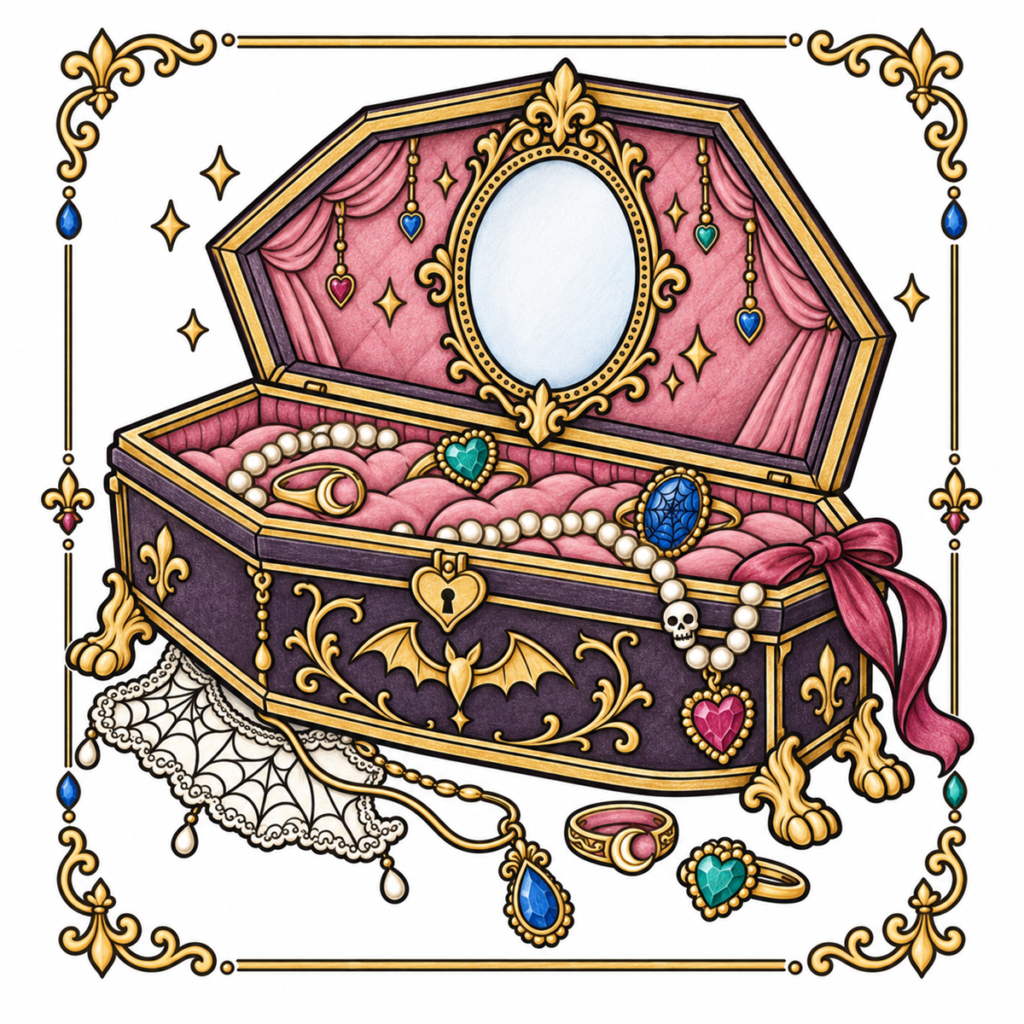
AI-generated color inspiration using the Jewel-Tone Gothic palette, with supporting colors and a colored-pencil-style finish.
1. Start with a Charcoal-Plum Box
Choose a muted charcoal plum for the outside of the box. This deep color gives the gold scrollwork and trim a clear backdrop.
Build up the color in light layers, adding slightly deeper shading near corners and beneath the upper rim. Keep enough lightness in the panels for the black outlines to remain visible.
2. Connect the Details with Warm Gold
Use Warm Gold (#E0B86A) as a guide for the box edges, ornamental feet, lock, mirror frame, and jewelry settings. Repeating gold in the decorative border helps tie the whole page together.
For a softly shaded finish, leave narrow lighter areas along selected curves and deepen the color beside recessed edges. You can suggest gold with ordinary yellow-ochre and cream pencils; metallic pencils are optional.
3. Soften the Interior with Dusty Rose
Color the cushions and inner lining in dusty rose. Add deeper rose shadows between the cushions and within the folds of the draped fabric, leaving the raised areas lighter.
Keep the lining softer than the gemstones so the small jewels remain easy to see. Where a ring opening reveals the cushion beneath it, continue the surrounding rose color inside the opening.
4. Bring the Jewels to Life
Distribute the three jewel colors across separate pieces:
- Sapphire Blue (#356CB0): the oval jewel inside the box, the loose teardrop pendant, and selected small hanging gems.
- Emerald Teal (#168C78): the heart jewel on the cushions, the heart ring at the lower right, and a few smaller accents.
- Ruby Burgundy (#B43F68): the heart pendant hanging over the front of the box and selected decorative jewels.
Keep the metal settings gold to separate each stone from its surroundings.
To suggest depth, shade one side of a gem more strongly and leave a small lighter area on the other. Follow any existing internal lines, or use simple light-to-dark shading where there are no drawn facets.
5. Give the Ribbon Gentle Dimension
Use a slightly muted version of Ruby Burgundy for the large ribbon. Deepen the folds around the knot and where the fabric overlaps, then keep the broad curves lighter.
This repeats the ruby accents while giving the ribbon a softer, fabric-like appearance.
6. Keep Pearls and Lace Light
Use ivory for the pearl strands, lace, and small skull charm. Add restrained warm-gray or beige shading along the bead edges and beneath overlapping details.
These pale accents provide a gentle contrast to the dark box and colorful lining. The lace can stay mostly ivory, with its existing black pattern doing much of the decorative work.
7. Finish with a Pale Blue-Gray Mirror
Apply a very light blue-gray layer inside the mirror, with slightly more color near the edges and a lighter center.
A simple tint is enough to suggest glass. There is no need to draw a reflection or fill the mirror with extra details. Leave the surrounding page background white to keep the intricate jewelry box easy to read.
Make the Palette Work for Your Page
The four Jewel-Tone Gothic colors help establish the mood, but they don’t need to cover every object. Charcoal plum, dusty rose, ivory, and pale blue-gray give the brighter accents room to stand out.
Try repeating each jewel color in a few places, then step back and check the balance. Small areas of rich color can be enough to make a detailed coloring page feel lively and complete.
Try Vintage Gothic on a Ghost Bakery Coloring Page
Gothic colors can feel warm and welcoming, too. This Ghost Bakery example uses the Vintage Gothic palette to combine dusty mauve, charcoal plum, aged ivory, and soft brass accents.
Natural browns give the bread and wooden shelves a cozy warmth, while the pale ghost stands out against the softly colored bakery interior.
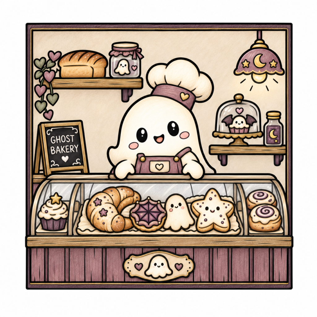
AI-generated color inspiration using the Vintage Gothic palette, with supporting colors and a colored-pencil-style finish.
1. Set the Scene with Mauve and Plum
Use Muted Mauve (#927781) as a guide for the counter panels, apron, chef’s hat band, and lampshade. Repeating this color across the scene helps the bakery feel coordinated.
Add Dusty Charcoal Plum (#4E3D4C) to selected framing, shelf supports, and deeper shadows. Keep these darker areas relatively small so the scene stays gentle and inviting.
For the counter panels, follow the direction of the existing wood lines with light pencil strokes.
2. Keep the Ghost Soft and Light
Leave most of the ghost white or very light cream. Use a light application of Aged Ivory (#D8C6B2) near the edges and beneath the hat to suggest soft shading.
Repeat this creamy color on the chef’s hat, ghost-shaped cookie, and selected icing. Small touches of muted pink on the cheeks add warmth.
Keeping the ghost lighter than its surroundings helps it remain the focal point.
3. Add Subtle Brass Accents
Take inspiration from Soft Brass Gold (#B29665) for the lamp fittings, apron buttons, display stand, and narrow border details.
Use a light golden tone for the moon and stars on the lampshade. Gentle ochre or brown shading can suggest an aged brass finish without metallic pencils.
Repeat these warm accents sparingly throughout the page.
4. Give the Bread Natural Baked Colors
Add cream, golden beige, and warm brown for the bread, croissants, and rolls. These supporting colors complement the Vintage Gothic palette and make the pastries look inviting.
Keep the raised centers lighter, then deepen the crusts, curved edges, and spaces between overlapping sections. Follow each pastry’s shape with your pencil strokes.
For the decorated treats, repeat mauve and plum in the cupcake wrappers, icing details, and spiderweb cookie. Use ivory for lighter frosting to keep the display varied.
5. Color the Walls, Wood, and Small Details
Use a light layer of aged ivory or warm beige on the wall. Keep it slightly deeper than the ghost so their shapes remain distinct.
Choose warm brown for the shelves and counter ledges, with lighter areas along their upper edges. For the trailing heart-shaped leaves, alternate muted sage with a few mauve accents.
The jars can repeat the same restrained colors: pale gray for glass edges, mauve for their contents or fabric covers, and ivory for the small ghost motif.
6. Suggest Glass with Light Shading
Keep the display-case glass and cake dome mostly light. A little pale gray near their edges is enough to suggest glass while allowing the treats inside to remain visible.
If you want a reflected highlight, leave a narrow strip of paper uncolored. Avoid covering the entire glass area with a heavy gray layer.
Preserve the dark chalkboard and its light lettering for a clear finishing detail.
Make It Your Own
The four palette colors establish the vintage mood, while browns, cream, muted pink, and sage help individual objects feel complete.
You can simplify this example by choosing one mauve, one dark plum, one cream, and one golden brown to begin. Add other colors only where you want them, and use lighter or heavier pencil pressure to create variation.
Try this combination on the free Ghost Bakery coloring page from our collection of free cute gothic coloring pages.
Try These Palettes on Free Cute Gothic Coloring Pages
Ready to put your favorite palette to use? Explore our collection of eight free gothic coloring pages, available as individual PNG files and a printable PDF.
Try a crescent moon with Midnight Gothic, a moth with Mystic Moonlight, or a greenhouse with Enchanted Forest. You can also print the same design twice and see how a different palette changes its mood.
Explore our free gothic coloring pages.
Frequently Asked Questions
Can I Use These Color Palettes with Colored Pencils?
Yes. Choose the closest shades in your collection rather than searching for an exact match. Swatch them together first, then adjust your pencil pressure to make some areas lighter or darker.
The relationship between the colors matters more than matching every swatch perfectly.
What Are HEX Color Codes Used For?
A HEX code is a six-character code used to specify a digital color, usually written with a # at the beginning. For example, #DFBA76 is the Antique Gold reference in the Midnight Gothic palette.
You can enter these codes into many digital art apps. They are not colored-pencil or marker product numbers, and they do not guarantee an identical printed result.
Do I Need to Use All Four Colors?
No. You can use two or three colors, keep one as a small accent, or add a neutral from your own supplies. Leaving parts of the page white is also a useful choice.
These palettes are flexible starting points. Change them to suit the picture and the mood you enjoy.
Explore More with Cute Gothic Oddities
If you enjoy cute bats, moonlit scenes, and wonderfully strange details, discover Cute Gothic Oddities by Shima Artworks.
This gothic coloring book for adults includes 42 single-sided coloring designs, with a mix of cute, weird, and whimsical subjects. Use the palettes in this guide as starting points, or create your own combinations as you color.
Take a look inside Cute Gothic Oddities on Amazon.
Choose the palette that catches your eye, pick a page, and start with one small area. There is no need to decide every color before you begin.
